Why shutter colour matters more than most people expect
Plantation shutters are a fitted architectural element, not a soft furnishing — they sit in the window reveal, read as part of the room's joinery, and are visible every day for ten to twenty years. That permanence changes the stakes of the colour decision relative to, say, a cushion or a rug. A poorly chosen wall paint can be repainted in a weekend; a poorly specified shutter colour cannot. The good news is that the parameters of the decision are genuinely narrow: shutters need to relate to the painted joinery of the room — skirting boards, architraves, window frames, internal door frames — not to the wall colour or the sofa. Once that reference point is established, the choice narrows considerably.
The colour also affects how light behaves in the room. A bright white shutter reflects available daylight back into the space, making rooms feel larger and more luminous when louvres are angled upward toward the ceiling. A darker shade — charcoal, deep grey, or a forest green — absorbs more light, increasing the visual weight of the window treatment and making the window itself more of a designed feature within the room's scheme. For an overview of current design directions, our auto-blog 2026 window treatment trends guide sets the context for where shutter colour sits within broader interior design movement. The full range of colour options available across all materials is also covered in our shutters colour options guide.
White and off-white: why they dominate and which shade to choose
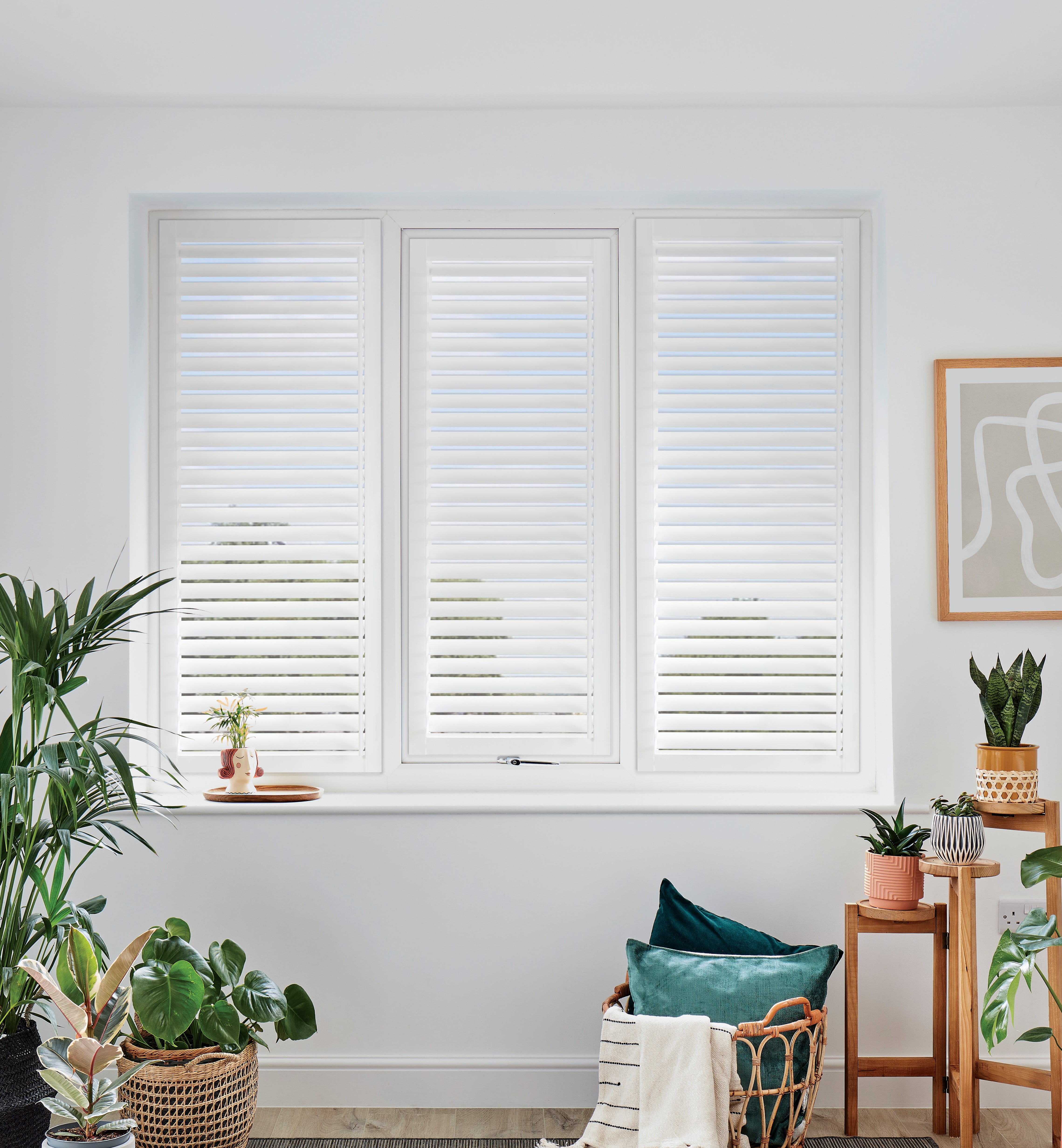
White and off-white account for roughly seven in ten shutter orders in the UK, and the reasons are structural rather than a lack of imagination. Most painted joinery in the UK housing stock — Victorian terraces, Edwardian semis, 1930s semis, and post-war and new-build properties alike — is finished in a white or near-white paint. A shutter colour matched to the existing skirting boards and door architraves sits quietly as part of the architecture rather than competing with it. The result is a window treatment that reads as designed-in rather than applied after the fact, which is the most consistent quality outcome across all property types.
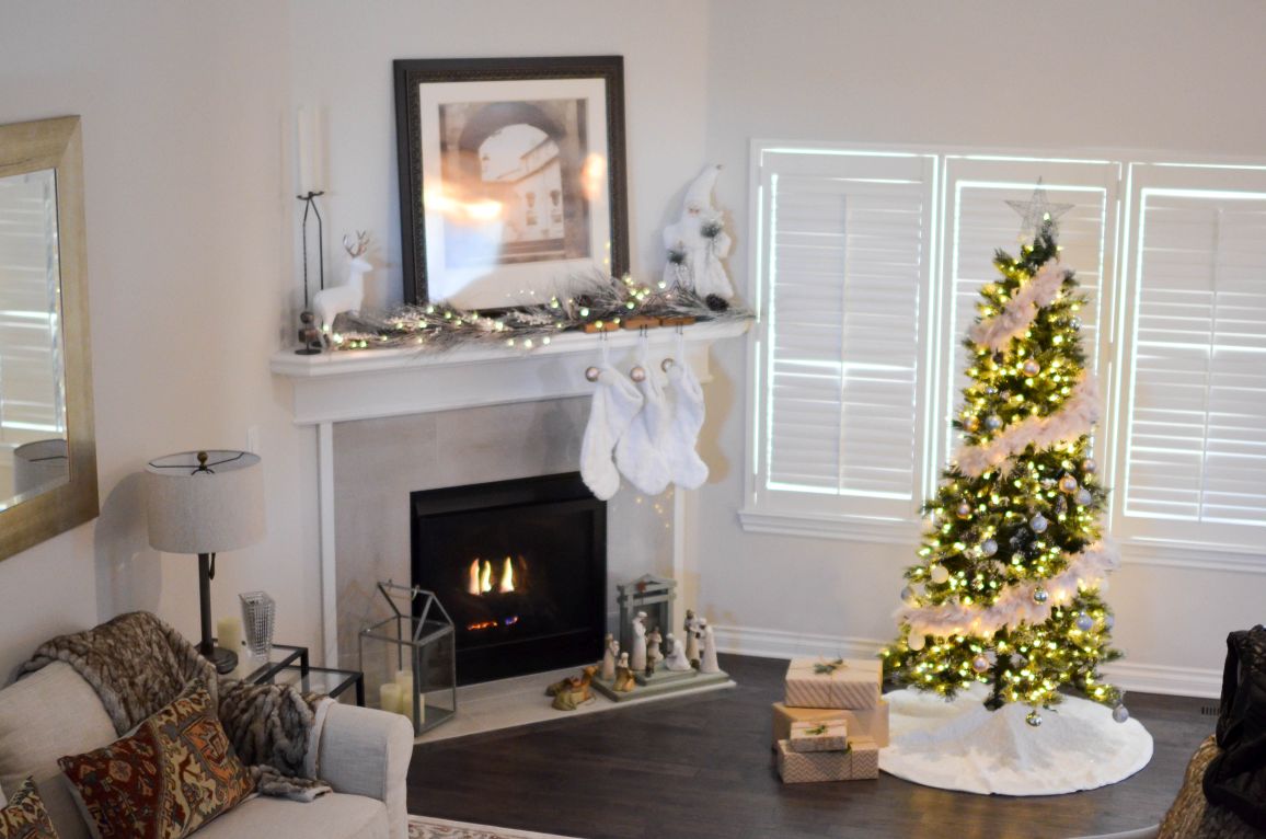
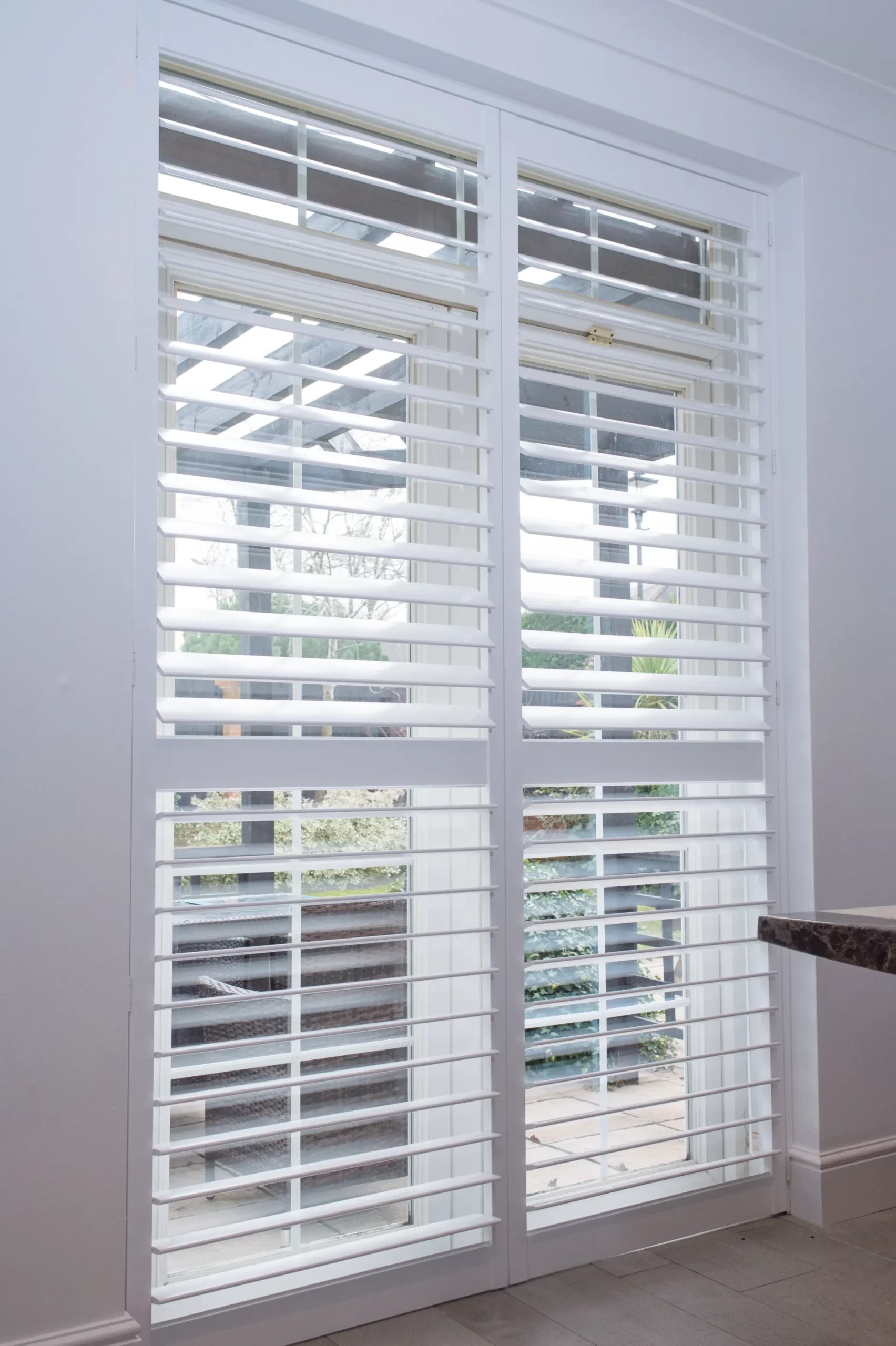
The practical question within white and off-white is which specific shade to choose. Pure brilliant white — the classic trade gloss white common in Victorian and Edwardian terrace joinery — suits homes where the skirting boards and architraves are a high-contrast, clean white. Aged white, ivory, and warm off-white shades suit homes where the joinery has a warmer undertone, or where deliberate interior decisions have introduced warm tones in linen, timber, or natural flooring materials. A mismatch between the shutters and the skirting boards — shutters that read as cold white against warm cream joinery — is the most common colour error and the one most easily avoided by bringing a paint chip from the existing woodwork to the sample selection. For a dedicated treatment of the white shutter decision, see our auto-blog white plantation shutters guide, which covers shade selection and the different whites available across the product ranges. Full-height shutters in white or off-white are the single most commonly specified configuration across all property types in the UK.
Endura hardwood shutters are factory-painted and can be matched to any RAL or Farrow & Ball colour, which makes them the right specification for homes where an exact match to bespoke joinery paint is required. For our full written overview of the Endura range, see the Endura hardwood shutters guide, which covers paint finish options alongside material specification, louvre sizing, and lead times.
Warm neutrals and muted tones: the 2026 direction
The clearest shift in shutter colour selection in 2026 is a move away from stark, pure whites toward warmer neutral tones — particularly putty shades (the warm off-whites associated with Farrow & Ball's Estate Emulsion palette), soft greiges (grey-beige blends), and muted sage greens. These colours sit between the classic white specification and a deliberate bold choice: they are not trying to be invisible, but they are not making a strong statement either. They work particularly well in homes where natural materials — stone floors, limed oak joinery, rattan, linen — have been introduced as a reaction against the hard-contrast minimalism of the previous decade.
The shift corresponds to a broader interior design movement that prioritises warmth and texture over cool, high-contrast palettes. In a room with warm oak flooring, limestone-effect tiles, and a plaster-finish wall in a pale clay tone, brilliant white shutters can feel out of register — reading as too cold and too clean against the warmth of the other materials. A putty-toned or warm sand shutter in the same room sits within the palette rather than against it. Mimeo composite shutters are available in a range of whites and neutrals and are the recommended specification for kitchens, bathrooms, and utility rooms — rooms where moisture resistance is the primary material requirement and where a warm neutral finish reads just as well as a pure white. For detailed guidance on the practical aspects of maintaining any shutter colour, our plantation shutters cleaning guide covers the correct approach for all materials and finishes.
Bold and custom colours: when they work and when they do not
A small but growing proportion of UK shutter orders in 2026 specify bold or custom colours — deep slate blues, forest greens, charcoal greys, and dusty terracottas. These decisions almost always originate in the same place: a room where the wall colour is already strong and the shutters are intended to sit within that colour story rather than provide a neutral counterpoint. A deep petrol-blue kitchen with painted cabinetry is a natural environment for dark-grey or navy-toned shutters; a sage-green reception room in a period terraced house might carry a sage or moss-toned shutter well when the overall interior scheme has been designed to that level of specificity.
The risk with bold colours is that they age less gracefully than neutrals, both in the sense that fashions shift and in the sense that the wrong bold colour choice is much more visible than the wrong neutral. The practical guideline is to use bold shutter colours only in rooms where a strong colour commitment has already been made to the wall colour and the furniture — shutters should follow the room's existing colour direction, never lead it. For rooms where a natural, organic warmth is the goal but white feels too flat, the stained option deserves consideration rather than a painted bold shade.
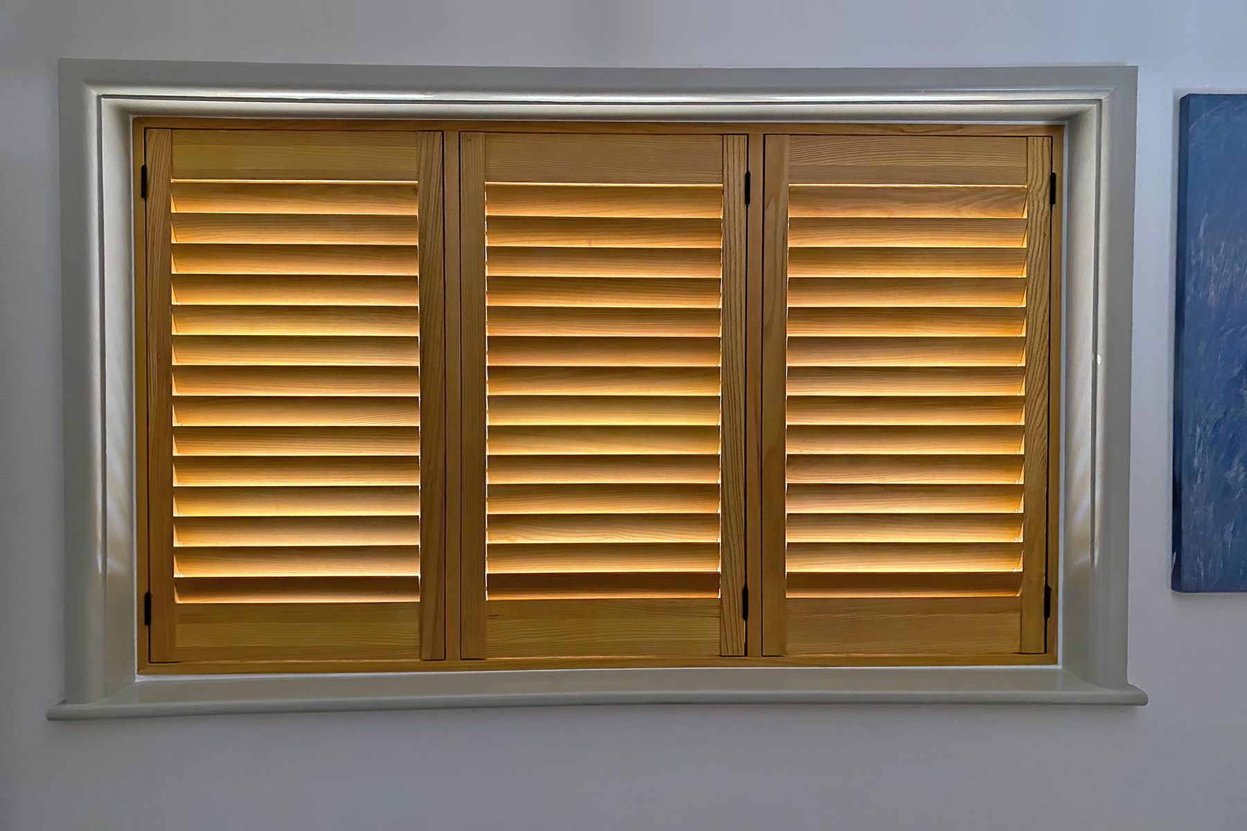
Natural wood stains: the alternative to painted finishes
Painted finishes account for the large majority of UK shutter specifications, but natural wood stain finishes occupy a distinct and growing niche for homeowners who want the organic warmth of visible timber grain rather than a painted surface. Stained shutters are available on timber ranges — notably the Graino Paulownia range — and offer multiple tones from pale ash through to deeper walnut shades. The design logic for stained shutters is different from painted: they work best in rooms where natural materials and organic textures are the dominant interior language, not where painted joinery sets the reference.
The key practical distinction is that stained shutters do not pretend to be architectural joinery in the same way a painted shutter does. They introduce a furniture-like warmth to the window — visible grain, tonal variation, a surface that reads as crafted rather than built-in. Graino Paulownia shutters are finished with a stain that enhances the natural grain of the Paulownia timber, with tones ranging from light to mid-depth. They suit interiors where exposed timber, natural linen, woven textiles, and stone or terracotta floors are the primary material palette. In a period interior dominated by paint — white joinery, papered walls, parquet floors — a stained shutter introduces a material contrast that may or may not be deliberately wanted; the decision should be made with the full room context in view.
A practical step-by-step for choosing your shutter colour
The most reliable approach to shutter colour selection follows four steps, each of which narrows the choice and reduces the risk of a mismatch that becomes apparent only after installation.
- Step 1: Establish the joinery reference. Look at your existing skirting boards, architraves, and internal door frames. What colour are they — pure white, warm white, cream, or a specific tinted shade? Your shutters should either match this precisely or consciously depart from it as a deliberate design decision. Accidental mismatch — shutters that are almost the same colour as the joinery but not quite — is the most common error.
- Step 2: Decide whether to match or contrast. Matching the joinery creates an architectural, built-in result that suits the broadest range of interiors. Contrasting with the joinery — say, darker shutters against white joinery — creates a stronger design statement and suits rooms where the window is intended to be a focal point rather than part of the background architecture.
- Step 3: Consider the room's light levels and orientation. North-facing rooms with limited daylight benefit most from white or off-white shutters that maximise light reflection. South- and west-facing rooms that receive strong afternoon sun can support darker or warmer tones without the room feeling diminished.
- Step 4: Request physical samples before confirming. Colours look different in different light conditions and on different surfaces. A sample tile or louvre section seen against your actual wall colour, in your actual light conditions, at different times of day, is the only reliable way to confirm a colour decision. All Shutters Factory surveys include physical colour samples. Living room shutters and bedroom shutters pages show finished installations across a range of colour specifications.
Prices, lead times, and getting started
Colour choice does not typically affect price — the cost of a painted finish in any standard shade within a product range's colour palette is included in the base price. Custom colour matching to a specific RAL or Farrow & Ball reference may carry a small supplement on some ranges; this is confirmed at survey stage. Natural stain finishes on timber products are priced within the same range as painted finishes on the same material.
Supply-and-fit prices start from £380 per m² for Mimeo composite and from £550 per m² for Endura painted hardwood. Lead times are typically 4–6 weeks for composite and 6–8 weeks for hardwood from confirmed order to installation. Browse finished colour examples across the full product range and the shutters gallery. To see physical colour samples in your own home and receive a fixed written quote, book a free home survey — pricing is confirmed within 48 hours of the visit with no obligation to proceed.