Why white, off-white, and cream are meaningfully different colours
In a brochure or on a screen, white, off-white, and cream can look almost identical. In your window reveal, under the particular light of your home, the difference between them is immediately apparent — and it is not primarily about brightness. The key variable is undertone. Pure white has no noticeable undertone — or a faint blue-cool cast in some factory-applied finishes — which makes it appear crisp and defined in daylight and under LED lighting. Off-white has a neutral-to-warm undertone that sits comfortably between the two extremes without committing to either. Cream has a pronounced warm undertone — yellow, ivory, or golden — that reads as warmth and character in rooms where surrounding materials support it, and as slightly dingy in rooms where they do not.
The range of shades available across Shutters Factory product lines spans this full spectrum. The most common white specification is equivalent to RAL 9010 (Pure White) — the closest match to the trade gloss used on most Victorian and Edwardian joinery and the standard reference for modern new-build skirting boards. For off-white, Farrow & Ball's 'All White' (No. 2005) and 'Wimborne White' (No. 239) describe the territory accurately; for cream, 'Clunch' (No. 2009) bridges the gap between off-white and definite cream. Our 2026 guide to the best shutter colours for UK homes covers the full palette from whites through to bold tones and natural stains for homeowners who want to explore the broader colour landscape.
Pure white: when the crispest shade is the right choice
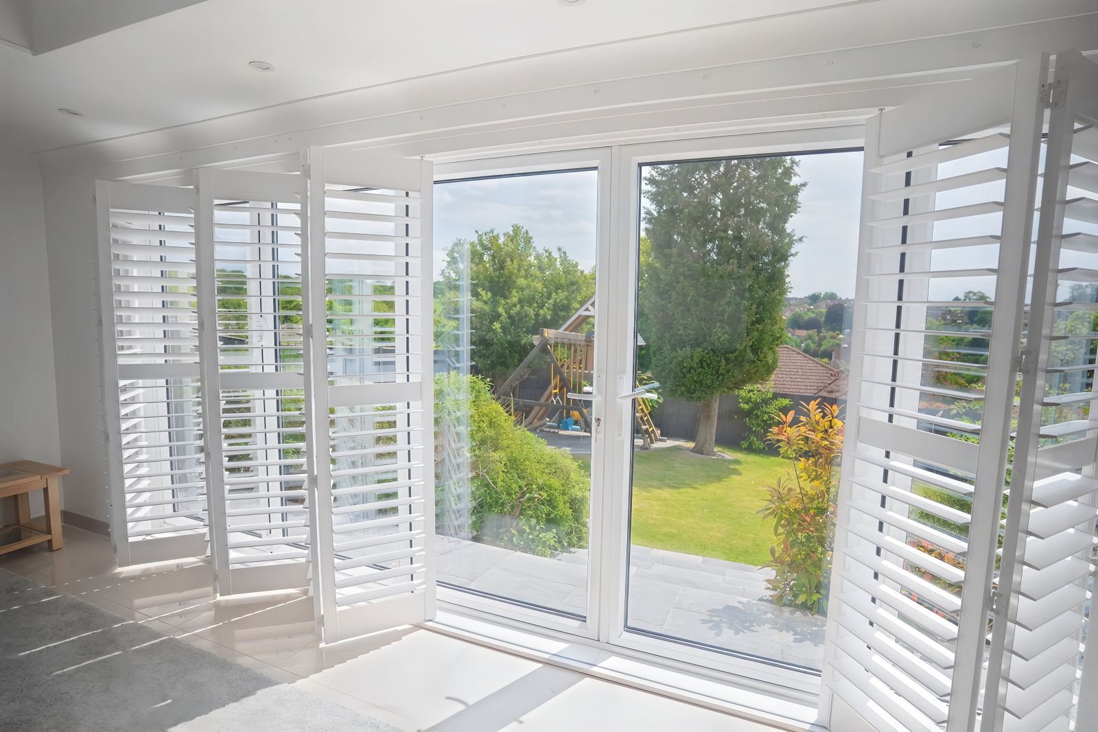
Pure brilliant white is the default specification for most new-build and recently renovated UK homes. Post-2000 new-build joinery — skirting boards, architraves, window frames — is almost universally finished in brilliant white. Shutters in the same shade sit as part of the architecture: a window treatment that reads as designed-in rather than applied afterwards. Pure white also performs well in contemporary interiors — exposed concrete, pale stone floors, grey walls, brushed steel fittings — where warmth is not the design goal and crisp definition is. In north-facing rooms with limited natural daylight, pure white shutters are particularly effective: the reflective surface bounces available light back into the space, making the room feel substantially brighter than a cream or darker shade would. The single-tier louvred style that spans the whole window opening in pure white is the most commonly specified configuration in north-facing living rooms and bedrooms, where the full-height louvre maximises both light admission and light reflection.
The risk with pure brilliant white is context mismatch. In a Victorian or Edwardian property where the joinery carries a warm cream patina from years of repainting, newly installed pure white shutters can read as jarring against the surrounding woodwork — not wrongly specified for the property type, but wrongly matched to the specific joinery colour. The solution is straightforward: bring a paint chip from the skirting boards to the survey, or hold a physical sample against the architrave before confirming. A near-miss between shutter white and joinery white is more noticeable than the original colour difference might suggest, because the panels occupy the visual centre of the wall.
Off-white: the most versatile and forgiving neutral
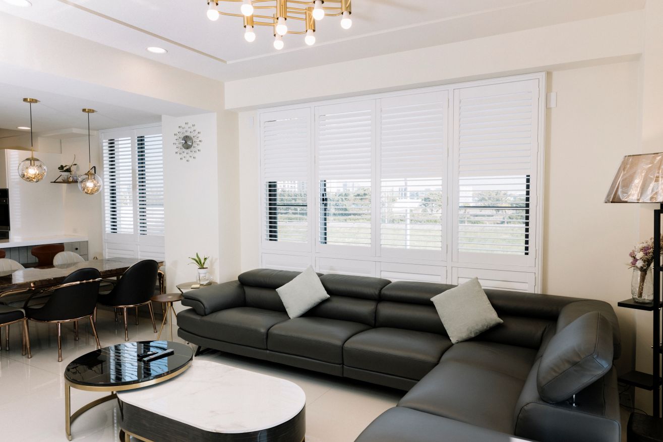
Off-white is the specification most likely to work across the widest range of UK properties. Its neutral-to-warm undertone sits comfortably against both the cool whites of new-build joinery and the warmer creamy whites of period joinery that has been repainted over decades. It does not fight with warm-toned walls, timber floors, or natural fabric furnishings. In a room with Farrow & Ball 'Elephant's Breath' walls, pale oak boards, and linen upholstery, an off-white shutter disappears quietly into the architectural background — which is, for most homeowners, exactly the right result. Our guide to all available shutter colour options expands on how off-white performs against a wide range of wall colours and joinery specifications across the product range.
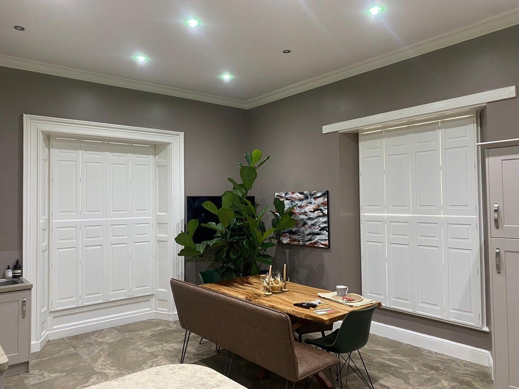
Off-white is also the most consistent shade across changing light conditions. A west-facing living room in afternoon sun can make a pure white shutter read as luminously bright; the same room at 8am on a grey November morning can make it look slightly cold. An off-white shutter sits warmly across these lighting changes, maintaining an inviting quality when pure white might feel harsh. For street-facing rooms in Victorian or Edwardian properties, shutters where the upper and lower halves are hinged independently in off-white are a natural choice: the subtle warmth of the off-white reads more sympathetically against period joinery than stark brilliant white, and the tier configuration manages the street-facing privacy and light requirements that front-room windows typically need.
Cream: warmth for period properties and natural interiors
Cream — true cream, with a visible warm-yellow or ivory undertone — works best where surrounding joinery already carries that warmth: a Victorian parlour where the skirting boards were last painted in magnolia or warm cream; a Georgian room with cornicing in a pale warm white; a cottage interior where thick plaster walls and hand-painted woodwork have acquired a gentle patina. In these environments a cream shutter sits within the colour family of everything around it rather than standing apart from it. Shutters covering just the lower half of each casement in a cream finish are a classic choice for period cottage interiors — the warmth of the shade complements stone flags, low beams, and small casements naturally, providing pavement-level privacy while leaving the upper portion open to sky and garden views.
The challenge with cream in a contemporary interior is that it can read as dated. In a kitchen with white cabinetry and stainless steel appliances, or a contemporary bathroom with clean white tiles, a cream shutter introduces warmth that the room has been designed to avoid. In those contexts, white or off-white is the more coherent choice. The practical rule: if your interior has warm tones — honey-coloured timber, terracotta tiles, warm-yellow plaster walls, natural linen and wool — cream is worth considering seriously. If your interior is cool-toned or neutral, it is not. For homes where a warm natural aesthetic is the goal but white feels too flat, our guide to white plantation shutters and the alternatives covers when to choose painted finishes and when natural timber grain might serve the room better.
How light changes how whites look — and why you must test
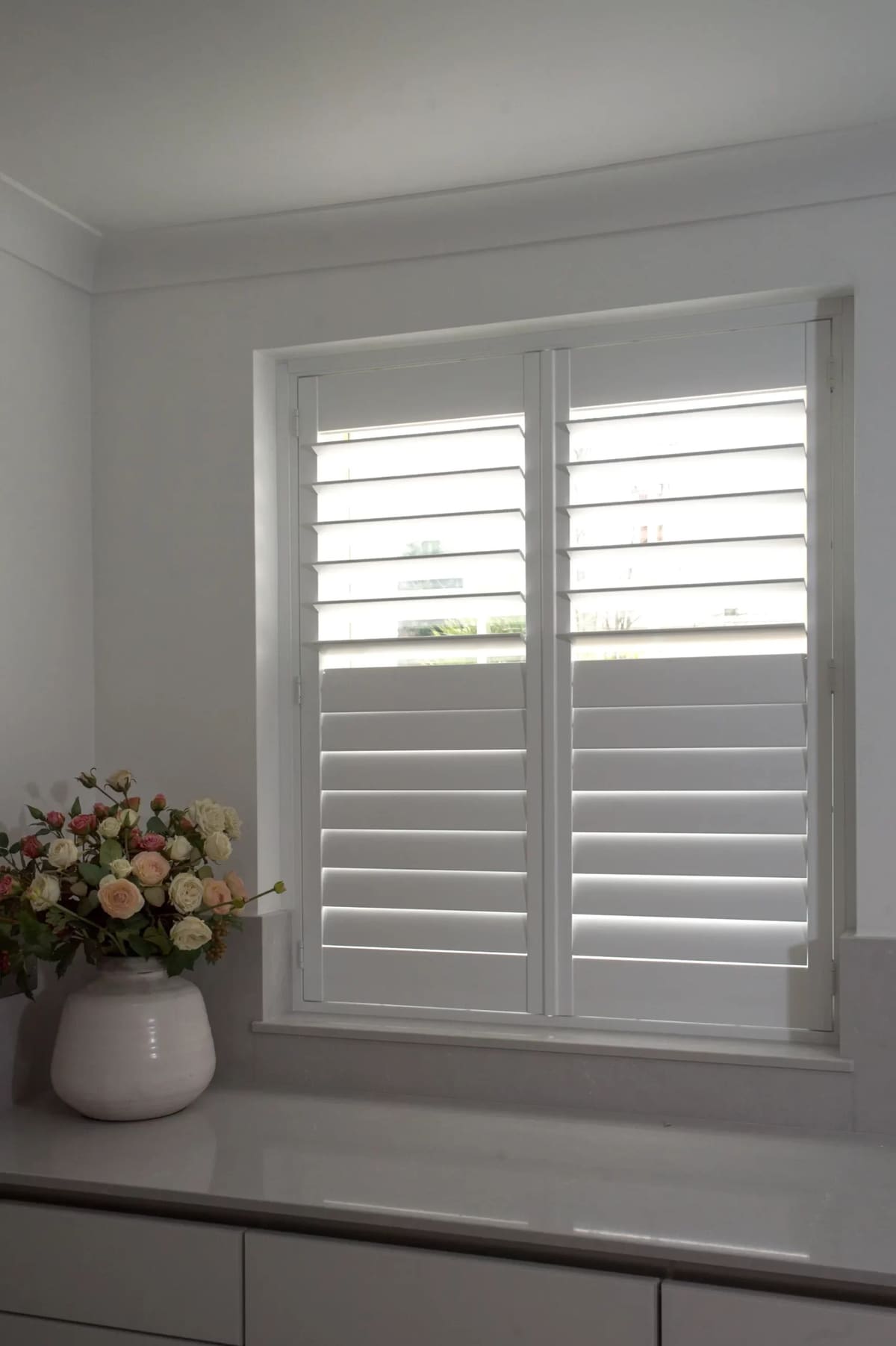
The most consistent source of colour specification error is failing to test a sample under the right conditions. Colours shown on a website or brochure are reproduced under standardised conditions that may bear no relation to the light in your home. A shutter that reads as perfect off-white in a south-facing showroom may look warm cream in your north-facing bedroom, or cold grey-white in an artificially lit bathroom. Three testing conditions are the minimum for a reliable decision: natural morning light (shows the true cool or warm cast under low-angle, scattered light); natural afternoon light against your actual wall (west-facing rooms will reveal whether an off-white is reading as cream in warm-angled afternoon sun); and evening artificial light (warm LED bulbs at 2,700–3,000K intensify warm undertones, whilst cool LEDs at 4,000K neutralise them).
All surveys include physical colour samples placed against your own windows in your own home. This single step eliminates most colour specification errors. See how different shades behave in different room types and orientations in our living room shutter installations, which show finished projects across a range of white and off-white specifications, and in our bedroom shutters gallery, where light management and colour accuracy are the primary concerns.
Materials, custom colour matching, and 2026 pricing
Mimeo composite shutters are available in a range of whites and off-whites and are the standard recommendation for kitchens, bathrooms, and any room with elevated moisture — the composite construction is moisture-resistant throughout, not just at the surface, and will not crack, warp, or discolour in condensation-prone environments. Endura hardwood shutters, factory-painted, can be matched to any RAL or Farrow & Ball reference, making them the right specification when an exact colour match to bespoke joinery paint is required. Our dedicated white plantation shutters page consolidates available shades and shows how each looks across different room settings and product ranges.
Supply-and-fit prices start from approximately £350–£400 per m² for Mimeo composite and from £550–£620 per m² for Endura hardwood. A typical bedroom window of approximately 1.0m² in white composite is £350–£450 fitted. A whole-house installation across a three-bedroom period property typically runs from £3,500 to £6,000 depending on window count and specification. Colour choice within a standard palette does not typically affect price; custom RAL or Farrow & Ball matching may carry a small supplement, confirmed at survey stage. Lead times are four to six weeks for composite and six to eight weeks for hardwood from confirmed order to installation. Browse finished installations across all Shutters Factory shutter products and colour ranges, and view real projects in our finished shutter project portfolio. For ongoing care once fitted, our plantation shutters cleaning guide explains the correct maintenance routine to keep pale finishes pristine over the years. Book a free home survey to hold physical colour samples against your own joinery and receive a confirmed written quote — pricing confirmed on the day, no obligation to proceed.