Why the match between shutters and woodwork matters
Plantation shutters occupy the same visual zone as door frames, skirting boards, and architraves. Because shutters cover a window reveal, the frame and panels become part of the room's fixed joinery register — they sit alongside doors, cornices, and built-in shelving rather than in the realm of upholstery, rugs, or wall colour. This means the shutter finish reads alongside the woodwork in a way that curtains or blinds typically do not. A curtain falls in front of the window and is understood as a soft furnishing; a shutter panel is fitted into the reveal and reads as architecture.
The implication is that a tone clash between the shutter finish and the joinery colour is immediately visible — not as a mismatch between soft furnishings, but as an inconsistency in the fixed fabric of the room. The same applies to flooring: in a room with exposed timber floorboards, the warmth or coolness of the wood grain sits in the eye-line immediately below the window sill, making any tension between the floor tone and the shutter finish perceptible across the full height of the window wall.
White and off-white: the neutral that usually works best
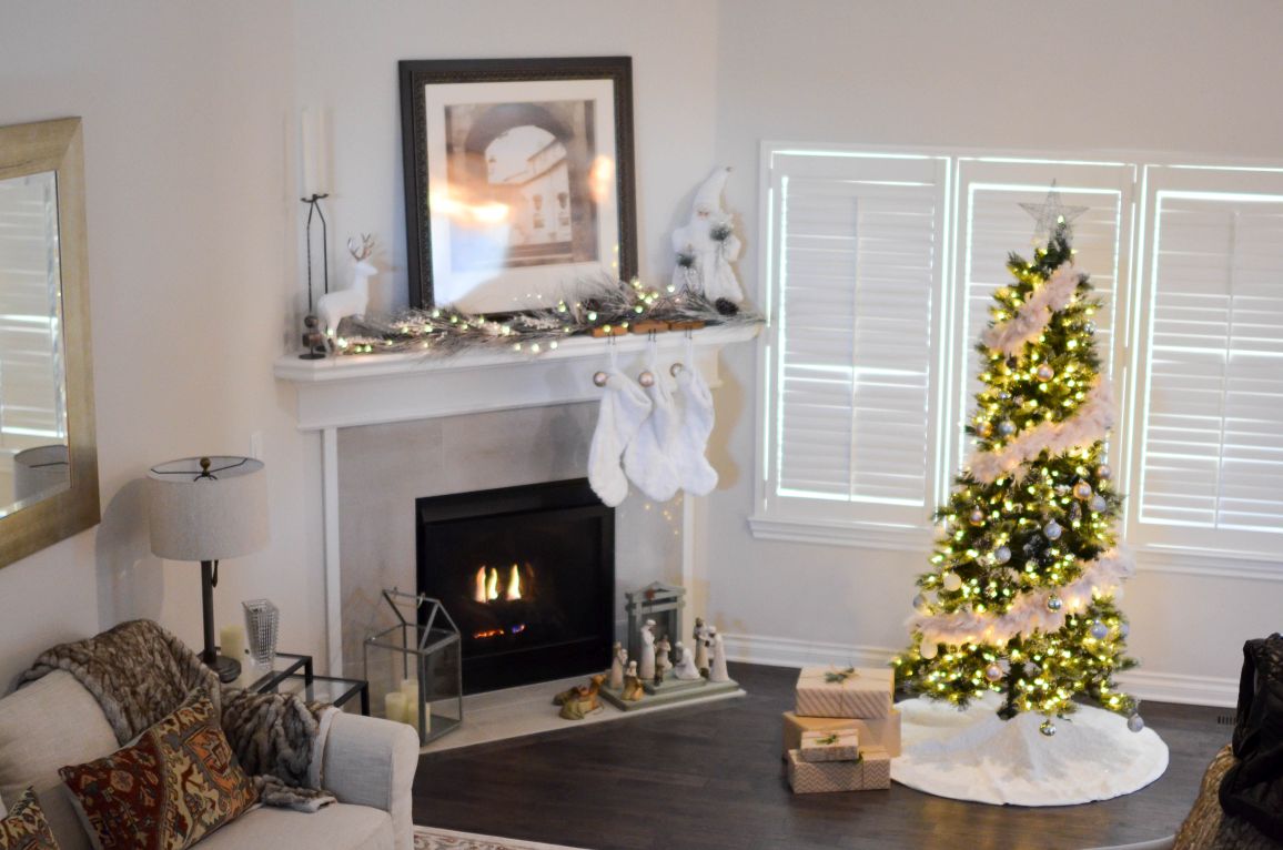
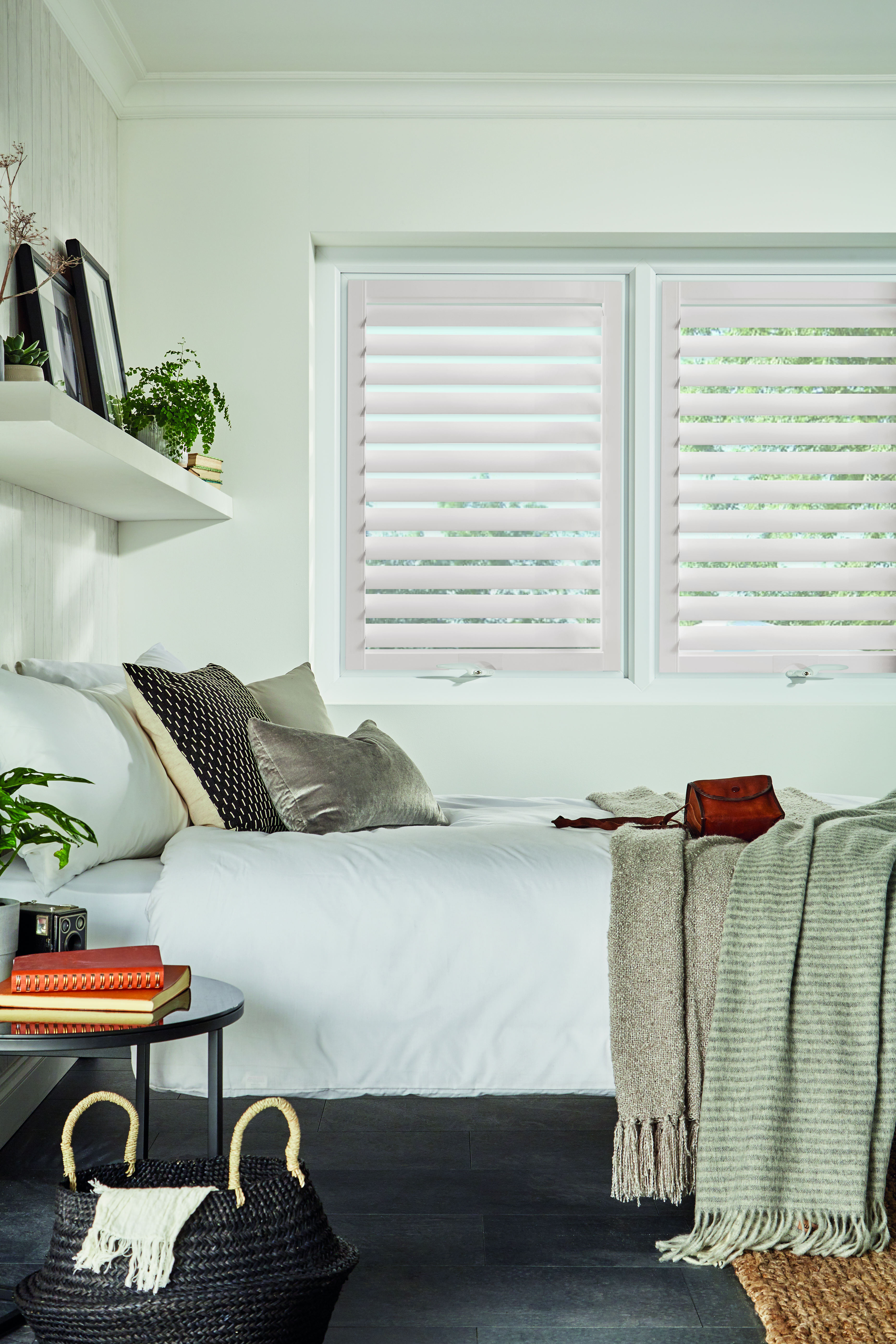
The vast majority of plantation shutters specified in UK homes are finished in white or off-white, and this reflects the reality that a white shutter operates as a neutral that defers to the rest of the room rather than competing with it. A white shutter beside an oak floor, a pale painted architrave, and a light plaster wall recedes visually; a strongly coloured shutter in the same room advances. For most rooms, especially those with natural light fluctuating through the day, the neutral shutter approach is the lower-risk choice because it remains compatible with the room as elements change — new flooring, new paint colour — without requiring a shutter replacement.
The critical variable within the white and off-white family is undertone. Shutter finishes are not a uniform white: some carry a warm yellow or cream bias, and others have a cooler pink or blue bias. An undertone that clashes with the joinery reads as visually wrong even when both elements appear correct in isolation. The most reliable approach is to compare sample boards alongside the existing joinery in the room's own light, since artificial showroom lighting can suppress the undertone difference. Our guide to shutter whites and off-whites covers the principal finish families and their undertone profiles — the right starting point before committing to a shade.
Warm floors: oak, pine, and honey-toned boards
Warm timber floors — including natural oak, reclaimed pine, honey-toned laminates, and bamboo — sit in a yellow-to-amber register. Paired with cool-white shutters, this contrast can read as intentional in a contemporary interior but feels stark in period rooms where the original joinery has a warm painted or waxed finish. In traditional and country-style interiors, the choice that integrates best is a warm off-white shutter — a cream or antique white — that echoes the warm cast of the floor without attempting to match it exactly. Attempting a direct tonal match between shutter and floor is rarely effective: the floor tone shifts with morning, afternoon, and evening light, and a shutter that looks well-matched at noon may appear orange-adjacent by lamplight.
For rooms where the floor is a strong character statement — reclaimed Victorian pine with visible knots, or wide-plank engineered oak with a brushed finish — a shutter that defers completely to the floor is the right choice. That means keeping the shutter white or off-white and letting the floor, and the rugs or furniture that relate to it, be the room's warmth source. For a hardwood shutter product where factory-applied paint can be matched to specific RAL or Farrow & Ball colour references to tie precisely to the joinery, Endura hardwood shutters offer the deepest paint specification of any product in the range.
Cool floors and painted woodwork: grey stone, laminates and dark joinery
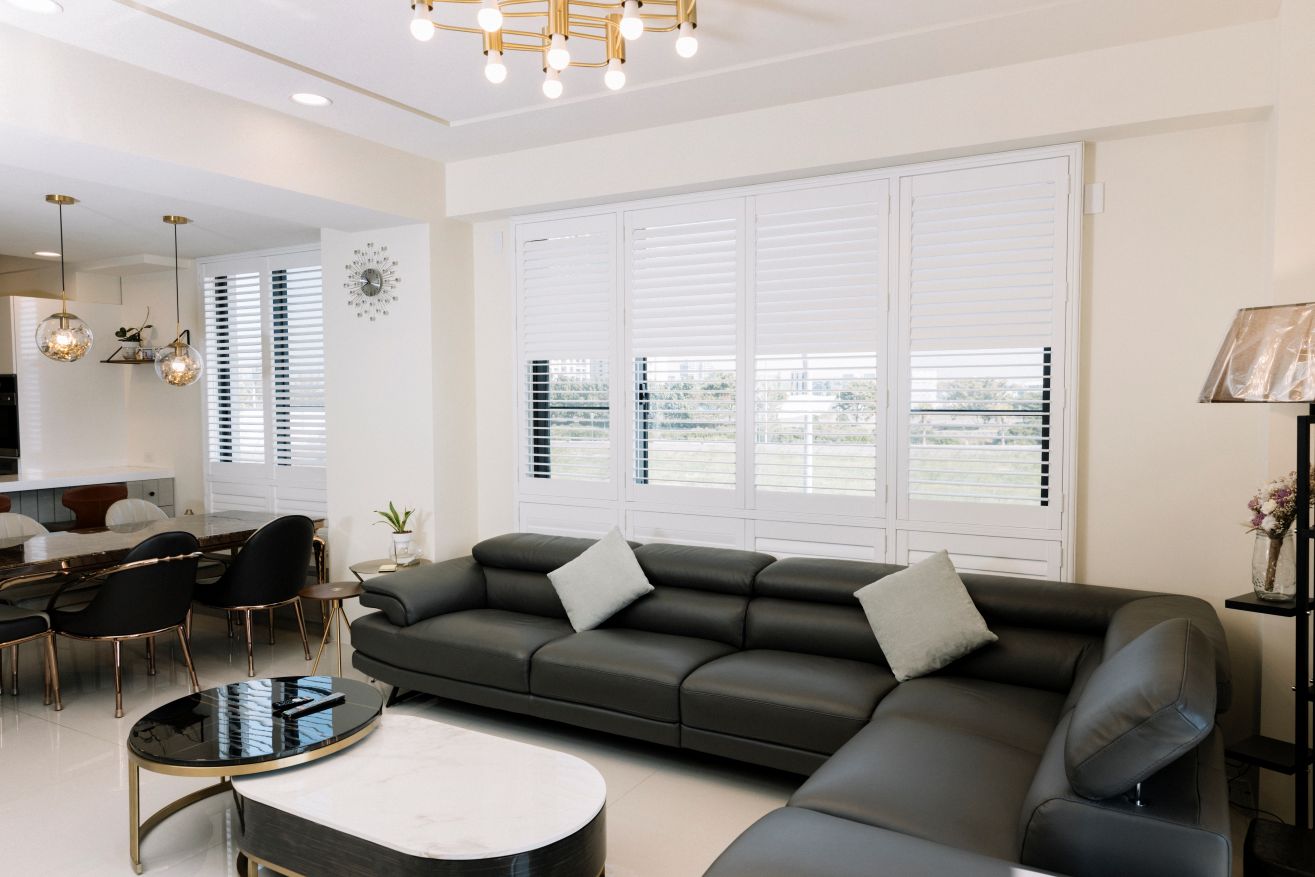
Grey stone floors, polished concrete, and grey-cast laminates present the opposite problem. Warm-white shutters beside a pale grey limestone floor read as faintly yellow — not in isolation, but in contrast. The correct choice in this context is a contemporary brilliant white or a cool off-white that echoes the grey bias of the floor rather than opposing it. Painted woodwork in Farrow & Ball's Purbeck Stone, Strong White, or Ammonite sits well beside a similarly cool shutter white; joinery and shutter become part of a coherent cool-neutral scheme rather than competing within the same colour temperature.
In rooms where the woodwork has been painted in a strong colour — navy, deep sage, or warm charcoal — matching the shutter finish to the woodwork colour produces the most integrated result. This approach reads as architectural and considered rather than clinical. Mimeo composite shutters are available in a range of whites and off-whites and can be specified in other colours on request, making them a practical choice for kitchens and living rooms where the woodwork is not conventional white. For colour choices beyond the white family — including how greys, naturals, and bespoke colours are specified — the full shutter colour options guide covers the palette and how each shade reads across different room types.
Natural wood shutters in timber-forward interiors
A smaller category of buyers — particularly those with period oak joinery, Arts and Crafts interiors, or contemporary Scandi-style rooms with exposed structural timber — choose natural wood shutters that emphasise the grain rather than conceal it under paint. Natural wood plantation shutters in a clear-lacquered or lightly oiled finish read as furniture rather than architecture, and in a room with exposed oak beams, oak floorboards, and painted casements, they integrate as part of the wood-forward interior scheme. This approach works strongly where other wood elements are present and reads as inconsistent in a fully contemporary scheme where timber is absent.
The species question matters in this context. Paulownia, the timber used in the Strato and Graino ranges, has a fine, tight grain and a pale, even tone that accepts oil or clear lacquer to produce a honey-yellow finish. Hardwood Endura panels can be factory-painted in a wood-toned colour on request, but the paint is opaque rather than transparent, so they do not read as natural timber. For a room where the floor is a specific species — Victorian pitch pine, or American white oak — a sample comparison between the proposed shutter species and the floor is always worthwhile, since species undertones do not always correspond to visual expectation: some pines are surprisingly cool, some oaks distinctly warm.
Period homes: matching shutters consistently across all rooms
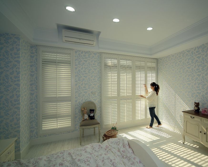
In a Victorian or Edwardian property where original skirting, architraves, and cornices run throughout the house, the shutter specification tends to work best when consistent with the joinery colour across all rooms rather than varied room by room. A single finish — typically a warm off-white consistent with the joinery white — applied across all windows reads as a coherent whole. Varying the shutter colour between rooms in a period property introduces a disruption that reads from the hallway: looking into a front room with cream shutters and through to a kitchen with brilliant white ones, the inconsistency is immediately apparent.
The exception is rooms that have been deliberately redecorated in a contrasting palette — a bathroom in a deep peacock blue or a kitchen with graphite cabinets — where the shutter can appropriately respond to the room's own scheme. In those cases, matching to the woodwork within the room takes precedence. For bedroom and living room installations where joinery context is a key part of the decision, bedroom shutter specifications and living room shutter options both set out how finish choices are guided by the surrounding room context. For real-room examples showing how specific finishes sit against actual joinery and flooring in completed UK homes, the Shutters Factory customer photo gallery is the most useful visual reference available.
Confirming the match before ordering
The correct process is always to compare physical sample boards against the actual joinery and flooring in the room's own light — not a photograph, not a showroom sample in isolation, and not a colour chip from a paint card. Shutter finishes are mixed and applied in batches, and the relationship between a finish code and the visual result depends on the base material and the gloss level in ways that are not fully captured in any photograph. The practical route is a home survey: the Shutters Factory surveyor brings sample boards across the relevant finish options and compares them directly against the floor and joinery before providing a recommendation. This removes the guesswork and gives you a confirmed match before manufacture begins.
For further reading before the survey, the 2026 guide to popular shutter colours covers the finishes being most widely specified in UK homes this year and how each sits in the context of current flooring and joinery trends. For inspiration across completed projects — from Victorian terraces with original pine floors to contemporary open-plan rooms with stone and polished concrete — browse our completed installation gallery to see how finishes perform in real rooms. When you are ready to confirm the right finish for your home, book a free home survey and the surveyor will bring the samples directly to you.